


Symbol:

Category: “Common Controls”
The element sets the value of a variable, depending on the position of the scroll bar.
Element properties
|
“Element name” |
Example: Optional Hint: Assign individual names for elements so that they are found faster in the element list. |
|
“Type of element” |
“Scroll Bar” |
Element property 'Center'
The properties contain fixed values for the coordinates of the point of rotation.
This point of rotation is shown as the  symbol. The point is used as the center for rotating and scaling.
|
“X” |
X-coordinate of the point of rotation |
|
“Y” |
Y-coordinate of the point of rotation |
You can also change the values by dragging the symbols () to other positions in the editor.
|
“Value” |
Variable as type integer that includes the position of the scroll bar. |
|
“Minimum value” |
Smallest value of the scroll bar (fixed value or variable). |
|
“Maximum value” |
Largest value of the scroll bar (fixed value or variable). |
|
“Page size” |
Page size
Requirement: Visible when the “Move to click” property is not selected. |
|
“Move to click” |
Behavior of the scroll bar at visualization runtime when it is clicked:
|
 : The scrollbar moves to the clicked position.
 : The scrollbar moves to one
 Element property 'Position'
The position defines the location and size of the element in the visualization window. These are based on the Cartesian coordinate system. The origin is located at the upper left corner of the window. The positive horizontal x-axis runs to the right. The positive vertical y-axis runs downwards.
|
“X” |
X coordinate of the upper left corner of the element Specified in pixels. Example: |
|
“Y” |
Y coordinate of the upper left corner of the element Specified in pixels. Example: |
|
“Width” |
Specified in pixels. Example: |
|
“Height” |
Specified in pixels. Example: |
You can also change the values by dragging the box symbols ( ) to other positions in the editor.
Element property 'Bar'
The property defines the representation of scaling and direction of travel.
|
“Orientation” |
Alignment of the slider; defined by the ratio of width to height.
You can modify the alignment in the visualization editor by using the pointing device to adjust the width and height of the Scroll Bar. |
|
“Running direction” |
The drop-down list varies depending on the alignment of the slider. Horizontal
Vertical
|
Element property 'Colors'
The properties contain fixed values for setting colors.
|
“Color” |
Color for the element in its normal state. Please note that the normal state is in effect if the expression in the “Color variables Toggle color” property is not defined or it has the value |
|
“Alarm color” |
Color for the element in alarm state. Please note that the alarm state is in effect if the expression in the “Color variables Toggle color” property has the value |
|
“Transparency” |
Value (0 to 255) for defining the transparency of the selected color. Example |
Element property 'Texts'
The properties contains character strings for labeling the element. The character string can also contain a placeholder with a format definition. In runtime mode, the placeholder is replaced by the current value in the specified format.
CODESYS accepts the specified texts automatically into the “GlobalTextList” text list. Therefore, these texts can be localized.
|
“Text” |
Character string (without single straight quotation marks) for the labeling the element. Add a line break by pressing the keyboard shortcut [Ctrl] + [Enter]. Example: The variable that contains the current value for the placeholder is specified in the property “Text variable Text”. |
|
“Tooltip” |
Character string (without single straight quotation marks) that is displayed as the tooltip of an element. Example: The variable that contains the current value for the placeholder is specified in the property “Text variable Tooltip”. |
Element property 'Text properties'
The properties contain fixed values for the text properties.
|
“Horizontal alignment” |
Horizontal alignment of the text within the element. |
|
“Vertical alignment” |
Vertical alignment of the text within the element. |
|
“Font” |
Example: “Default”
|
|
“Font color” |
Example: “Black”
|
|
“Transparency” |
Whole number (value range from Example:
Please note: If the color is a style color and already has a transparency value, then this property is write-protected. |
 : The
: The  : Drop-down list with style fonts.
Element property 'Text variables'
These properties are variables with contents that replace a format definition.
|
“Text variable” |
Variable (data type compliant with the format definition). It contains what is printed instead of the format definition. Example: Note: The format definition is part of the text in the property “Texts Text”. Note: If you specify a variable of type enumeration with text list support, then the
name of the enumeration data type is added automatically in angle brackets after the
variable name. Example: |
|
“Tooltip variable” |
Variable (data type compliant with the format definition). It contains what is printed instead of the format definition. Example: Note: The format definition is part of the text in the property “Texts Tooltip”. |
Element property 'Dynamic texts'
Dynamic texts are variably indexed texts of a text list. At runtime, the text is displayed that is currently indexed in the variable.
|
“Text list” |
Variable (string) or name of the text list as a fixed string in single straight quotation marks. Example:
|
|
“Text index” |
Text list ID. This refers to the desired output text.
|
|
“Tooltip index” |
Text list ID. This refers to the desired output text.
|
See also
Element property 'Font variables'
The variables allow for dynamic control of the text display.
|
“Font name” |
Variable ( Example: The selection of fonts corresponds to the default “Font” dialog. |
|
“Size” |
Variable (numeric data type). Contains the font size (in pixels or points). The applied unit is specified in brackets after the variable name.
 If you click in the value field, a drop-down list opens on the right for setting the unit. Hint: The font size is specified in points (example: Arial 12). Use points when the variable font size should match a font, for example if a font is set in the property “Text property Font”. |
|
“Flags” |
Variable ( Flags:
Note: You can combine the font displays by adding the coding of the flags. For example,
a bold and underlined text: |
|
“Character set” |
Variable ( The selection of character set numbers corresponds to the “Script” setting of the standard “Font” dialog. |
|
“Color” |
Variable ( Example: |
|
“Flags for text alignment” |
Variable (integer data type). Contains the coding for text alignment. Example: Coding:
Note: You can combine the text alignments by adding the coding of the flags. For example,
a vertical and horizontal centered text: |
Fixed values for displaying texts are set in “Text properties”.
Element property 'Color variables'
The Element property is used as an interface for project variables to dynamically control colors at runtime.
|
“Toggle color” |
The property controls the toggled color at runtime. Value assignment:
Assignment options:
|
|
“Normal state” “Alarm state” |
The properties listed below control the color depending on the state. The normal state
is in effect if the variable in “Color variables”, “Toggle color” is not defined or it has the value |
|
“Frame color” |
Assignment options:
|
|
“Filling color” |
Assignment options:
|
 to insert the placeholder
 The transparency part of the color value is evaluated only if the “Activate semi-transparent drawing” option of the visualization manager is selected.
Select the “Advanced” option in the toolbar of the properties view. Then all element properties are visible.
See also
Element property 'Absolute movement'
The properties contain IEC variables for controlling the position of the element dynamically. The reference point is the upper left corner of the element. In runtime mode, the entire element is moved.
|
“Movement” |
||
|
“X” |
Variable (numeric data type). Defines the X position (in pixels). Example: Increasing this value in runtime mode moves the element to the right. |
|
|
“Y” |
Variable (numeric data type). Defines the Y position (in pixels). Example: Increasing this value in runtime mode moves the element downwards. |
|
|
“Rotation” |
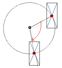
Variable (numeric data type). Defines the angle of rotation (in degrees). Example: The midpoint of the element rotates at the “Center” point. This rotation point is shown as the In runtime mode, the alignment of the element remains the same with respect to the coordinate system of the visualization. Increasing the value rotates the element to the right. |
 |
|
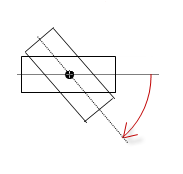
“Interior rotation” |
Variable (numeric data type). Defines the angle of rotation (in degrees). Example: In runtime mode, the element rotates about the point of rotation specified in “Center” according to the value of the variable. In addition, the alignment of the element rotates according to the coordinate system of the visualization. Increasing the value in the code rotates clockwise. The rotation point is shown as the Note: If a static angle of rotation is specified in the “Position Angle” property, then the static angle of rotation is added to the variable angle of rotation (offset) when the visualization is executed. |
 |
You can link the variables to a unit conversion.
The “X”, “Y”, “Rotation”, and “Interior rotation” properties are supported by the "Client Animation" functionality.
See also
Element property 'State variables'
The variables control the element behavior dynamically.
|
“Invisible” |
Variable (
Example: |
|
“Deactivate inputs” |
Variable (
|
The “Invisible” property is supported by the "Client Animation" functionality.
These properties are available only when you have selected the “Support client animations and overlay of native elements” option in the Visualization Manager.
|
“Animation duration” |
Defines the duration (in milliseconds) in which the element runs an animation
Animatable properties
The animated movement is executed when at least one value of an animatable property has changed. The movement then executed is not jerky, but is smooth within the specified animation duration. The visualization element travels to the specified position while rotating dynamically. The transitions are smooth. |
|
“Move to foreground” |
Moves the visualization element to the foreground Variable ( Example:
|
Element property 'Access rights'
Requirement: User management is set up for the visualization.
|
“Access rights” |
Opens the “Access rights” dialog. There you can edit the access privileges for the element. Status messages:
|
See also